Life would be dull without choices. Who wants to eat pasta every day, or be forced to watch reality TV every night? Not good. The same applies to the colours that surround our every-day lives. Imagine if every wall in the world was coloured beige and all garden sheds, fences and decking, together with furniture and window frames only came in mud brown?
At Blackburn-based coatings manufacturer AkzoNobel they know that supplying a range of colours and finishes is a crucial component of their everyday business in ensuring the professionals they supply are always given great choices.
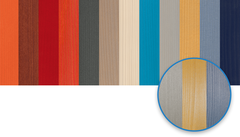
Providing a rainbow of colour choices is AkzoNobel’s Joinery Colour Classics range (JCC). This stunning set of colour choices combines their most popular translucent stain colours available in Europe with complimenting opaque shades in one fully comprehensive collection. This collection not only simplifies the design process and ordering, but also facilitates communications between manufacturers, building owners and architects. The Joinery Colour Classics are ideal for the industrial coating of dimensionally stable wooden constructions for exterior applications. A perfect enhancement to JCC is AkzoNobel’s Joinery Colour Classic Plus (JCC+) where they have produced a veritable cornucopia of colour options, which is the ‘real plus ‘in this range. This brilliant cross-referenced system means you can select the desired colour you want, and it becomes instantly clear at a glance which coloured primer and which coloured top coat will be required. With 10 coloured primers and 10 final coats, a total of an incredible 100 colour shades are available offering increased combinations of base stains and topcoats enabling more colour options as a final appearance.
In making it easier for industry professionals and users alike AkzoNobel have also produced an opaque easy-to-use way of accessing their formidable RUBBOL®Colour Collection. It’s the simplest way to see and choose from a concise selection of choices. The RUBBOL® sets show a variety of popular colours for opaque coating systems. It’s where the most popular choices from around Europe can be found. Again, all in one place and at your fingertips.
Discover the almost unlimited possibilities of colourful designs for opaque coating systems and all optimally aligned for wooden windows. In true AkzoNobel style, colours from other collections can also be easily realised with their stunningly beautiful RUBBOL® products.
Complimenting the above collections, AkzoNobel fully embrace the concept of garden colours by producing their Never Ending Impressions range which delivers a fascinating world of translucent colours mainly designed for semi or non-stable exterior timber components. Their Never Ending Impressions NEI collection, developed at the AkzoNobel Aesthetic Centre, shows the entire spectrum of harmoniously balanced colours from subtle to truly vivid. Effective wood protection and a naturally beautiful colour collection are typical features of these translucent coatings. By producing this free-thinking approach to colours, it leaves more room for creative freedom and the implementation of personal taste in colour and the final appearance for customers. Suitable for most garden construction applications including; cladding, sheds, fences, decking and garden furniture treatments is Sikkens CETOL® WF 771 from AkzoNobel. It’s technical qualities, ease of application, colour vibrancy and trouble-free maintenance make it a perfect choice for a selection of applications where UV light and moisture are an issue. As well as being perfect for application by brush for the on-site maintenance market, SIKKENS CETOL® WF 771 can also be used for application in factory environments by trade coaters. To meet the needs of commercial cladding coaters, SIKKENS CETOL® WF 771 provides a perfect coating solution, whether it is applied by vacuum coater, brush coater or automated spray lines… a real boon at the early stages of construction affording more quality control.
Carl Circus, UK Distribution Manager, AkzoNobel Wood Coatings said, “by providing a quick, easy to use web-based system for our customers to access a comprehensive range of products and colour combinations is hugely important”. He added, “we always ensure that above all our valued customers have choices. It’s a key part of our commitment to the marketplace”.
As part of the overall commitment to provide greater colour choices and options at the touch of a button or a glance at a screen AkzoNobel put great faith into providing professionals and the DIY enthusiast with a glimpse of the future in colour as they see it. Established in 2004, Colour Futures™ aims to build an annual picture of what home life will be like for consumers and create colour palettes that will transform their interiors accordingly. Colour Futures™ involves the selection and identification of AkzoNobel’s Colour of the Year, its hero palette and three supporting palettes. The trend analysis behind Colour Futures™ and the identification of the Colour of the Year is conducted by the AkzoNobel Global Aesthetic Centre, led by Creative Director Heleen Van Gent. Based in the Netherlands, it leads the company’s Decorative Paint’s trend analysis, colour research and design, and art direction. Each year, it invites a select group of independent experts to forecast the emerging global design trends for the year ahead and supports 80 global markets, empowering consumers to make the right colour choices for their homes.
With just one click of a button or the shift of a keyboard mouse the AkzoNobel world of colour combinations are at your fingertips.
To find out more about Colour Combinations by AkzoNobel please click here.


